 100% written by human
When people talk about UI5 development, they usually mean one of two things: UI5 applications or UI5 libraries. But there is a third option that many developers overlook — Fiori Launchpad plugins.
Plugins run inside the Fiori shell and can extend the launchpad itself: add header buttons, register user menu actions, or simply run in the background and do their job without any visible UI at all.
sap.ushell is not part of the OpenUI5 distribution.In my opinion, plugins are underrated. They are lightweight, powerful, and perfect for cross-app functionality that does not belong inside a single Fiori app.
Some real-world examples:
- Usage tracking across all launched applications
- Custom reporting or diagnostics triggered from the shell
- Global utilities like a fullscreen toggle, theme helpers, or support widgets
- Background automation that reacts to app lifecycle events
Plugin Architecture — Simpler Than You Think
Architecturally, a Fiori Launchpad plugin is very close to a regular UI5 application — just without views and controllers.
You start with a component (typically Component.ts or Component.js) and implement your logic inside the init() method. From there, you can use everything you already know from UI5 app development:
- OData models and
Componentmetadata i18nresource bundles- Standard UI5 controls and libraries
- TypeScript, ESLint, UI5 Tooling, and modern project setups
The main difference: instead of rendering a full application UI, you hook into shell services like Extension, AppLifeCycle, or UserInfo.
flowchart LR
    subgraph Plugin["Fiori Launchpad Plugin"]
        C[Component.init]
        E[Extension Service]
        A[AppLifeCycle Service]
        U[UserInfo Service]
    end

    subgraph Shell["Fiori Launchpad Shell"]
        H[Header Bar]
        M[User Menu]
        Apps[Running Fiori Apps]
    end

    C --> E
    C --> A
    C --> U
    E --> H
    E --> M
    A --> Apps
Adding Buttons and User Menu Actions
The Old Renderer Approach
In older UI5 versions, registering shell extensions was cumbersome. You had to fetch the renderer instance manually and work with APIs that changed frequently between releases.
Typical pain points:
controlTypeand placement options changed over time- Multiple header positions (
begin,end, etc.) with inconsistent behavior - Verbose boilerplate just to add a single button
- Harder to maintain when supporting multiple UI5 versions
A simplified example of the old pattern:
| |
It works — but it never felt clean.
The New Extension API (UI5 1.120+)
Starting with UI5 1.120, SAP introduced the dedicated sap.ushell.services.Extension API — a much clearer and more maintainable way to extend the shell.
API reference: sap.ushell.services.Extension
With the Extension API you can:
- Create header items (buttons in the shell header)
- Register user menu actions
- Show extensions globally across apps with
showForAllApps()
The trade-off: placement is more opinionated. Header items are supported at the end position, and user menu entries are first-class citizens — but you no longer get the old free-form renderer positioning.
Old Renderer vs. Extension API
| Topic | Old Renderer API | New Extension API (1.120+) |
|---|---|---|
| Service | Container.getRenderer() | Container.getServiceAsync("Extension") |
| Header buttons | Multiple positions (begin, end, …) | End position via createHeaderItem() |
| User menu | Manual renderer integration | Native createUserAction() support |
| API stability | Changed across UI5 versions | Dedicated, documented service |
| TypeScript support | Possible, but loosely typed | Clean async service typing |
| Recommended for | Legacy systems below 1.120 | New development on 1.120+ |
What Else Can a Plugin Do?
Beyond adding visible shell controls, plugins can interact with the application lifecycle and user context.
React to App Changes with AppLifeCycle
If your plugin needs to know when a Fiori app has finished loading — for example to attach listeners or read the active component — use the AppLifeCycle service:
| |
This is especially useful for plugins that need to interact with the currently open app component after navigation.
Access the Logged-In User
User information is available through the UserInfo service:
| |
Typical use cases: personalization, audit logging, feature toggles per user, or displaying context-aware shell actions.
Scaffolding a Plugin with TypeScript
Manually setting up a Fiori Launchpad plugin — especially with TypeScript, UI5 Tooling, and the correct shell integration — takes time. For this reason, I created a Yeoman generator in the UI5 Community:
→ GitHub: ui5-community/generator-ui5-ts-flp-plugin
The generator is built on top of Easy UI5 and scaffolds a ready-to-run Fiori Launchpad plugin project.
Highlights:
- TypeScript-ready project structure
- Automatic integration strategy based on the UI5 version you select
- Uses the Extension API on UI5 1.120+
- Falls back to the legacy renderer approach on older versions
- Includes shell extension sample
Quick Start
Install the generators globally:
| |
Scaffold a new plugin:
| |
Follow the prompts — especially the UI5 version — and start local development:
| |
The generator wires up the correct shell integration path for your target version, so you do not have to maintain two codebases manually.
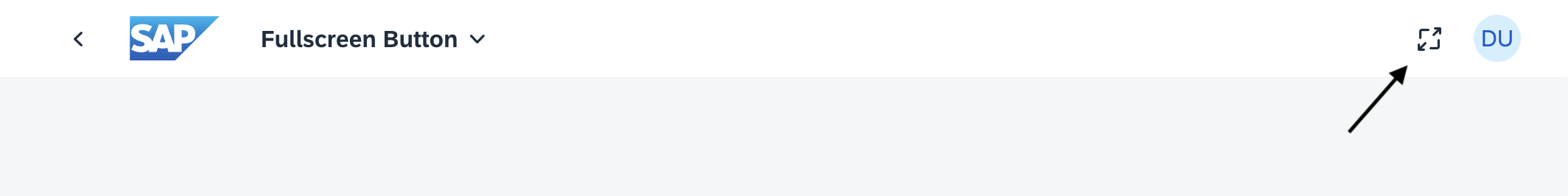
Sample Plugin: Fullscreen Toggle
To demonstrate the Extension API in practice, I built a small open-source plugin that adds a fullscreen toggle button to the Fiori shell header.
→ GitHub: mariokernich/fiori-fullscreen-plugin
The core logic loads an i18n bundle, creates a header item through the Extension service, and toggles the browser fullscreen API on press:
| |
A few things worth noting:
createHeaderItem()returns a promise — the API is fully asyncButton$PressEventgives you proper TypeScript typing for the press handlershowForAllApps()makes the button available across every launched Fiori appi18nworks exactly like in a standard UI5 application
Deploying and Activating the Plugin
Once your plugin is built, you need to register it in the launchpad landscape.
On-Premise (ABAP Fiori Launchpad)
Deploy the plugin as a BSP/UI5 application with sap.flp.type: "plugin" in manifest.json
Option 1: Register it in the Fiori launchpad configuration — typically as a global shell plugin via launchpad site / content administrator settings. Use T-Code /UI2/FLP_CUS_CONF and /UI2/FLP_CONF_DEF. With this option everyone will get the plugin loaded without any restriction.
Option 2: Assign the plugin through a PFCG role so authorized users load the extension at shell startup
SAP Build Work Zone
- Deploy the plugin as an HTML5 application (often via MTA to SAP BTP)
- Ensure
manifest.jsoncontains:
| |
- In the Work Zone Administration Console, refresh the HTML5 Apps content channel
- Add the plugin in Content Explorer and assign it to a role (for example,
Everyoneor a dedicated plugin role)
After assignment, the plugin loads automatically when users open the launchpad — no tile required.
Conclusion
Fiori Launchpad plugins are a powerful but often ignored extension point in the UI5 ecosystem. They let you enhance the shell itself — globally, cleanly, and without touching every individual Fiori app.
With TypeScript, the modern Extension API (UI5 1.120+), and a proper project generator, building plugins today is significantly more pleasant than wrestling with the old renderer APIs.
If you have a cross-app requirement — tracking, reporting, shell utilities, or lifecycle automation — a plugin is very likely the right tool for the job.
Useful links: